Just build it: Javascript clocks
04th August 2021
Full disclaimer: While this post is part of the just build it series I didn't actually build anything seen here. While writing code for yourself is probably the best way to learn it, you will spend a lot of your time as a developer just reading code.
So being able to learn and pick up on things just from reading code is as important as being able to write it. This is why it is so important to make your code as readable as possible. Sometimes the most elegant solution might take half the lines of code but it may take 3x the amount of brainpower to understand. It won't always be you maintaining that code so you should leave it in a state that anyone can understand what your purpose was.
Many of the topics that I have written about were actually noticed during code reviews on other people's work and I thought to myself; "That's cool, I should learn about that".
A javascript clock
I'm working on my Javascript as I don't work with it day-to-day but I enjoy it. I'm pulling examples from this post and the very first is a clock. I know I had the skill to be able to write a clock so instead of putting a few hours into building one I decided to find some examples of ones online and see how other people did them to see if they were similar to how I would have done it or not.
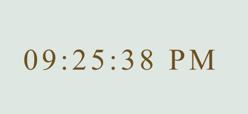
The casio model
The digital face is definitely the easiest option and it certainly gets the job done. All the simplicity and reliability of a casio. The code was found here but most importantly it is very easy to read and anyone with the most basic understanding of JS can follow this.
    <!DOCTYPE html>
    <head>
        <link rel="stylesheet" href="style.css" />
        <script async src="script.js"></script>
    </head>
    <body>
        <div id="MyClockDisplay" class="clock" onload="showTime()"></div>
    </body>
    function showTime(){
        var date = new Date();
        var h = date.getHours(); // 0 - 23
        var m = date.getMinutes(); // 0 - 59
        var s = date.getSeconds(); // 0 - 59
        var session = "AM";

        if(h == 0){
            h = 12;
        }

        if(h > 12){
            h = h - 12;
            session = "PM";
        }

        h = (h < 10) ? "0" + h : h;
        m = (m < 10) ? "0" + m : m;
        s = (s < 10) ? "0" + s : s;

        var time = h + ":" + m + ":" + s + " " + session;
        document.getElementById("MyClockDisplay").innerText = time;
        document.getElementById("MyClockDisplay").textContent = time;

        setTimeout(showTime, 1000);

    }

    showTime();
    body {
        background: #dee7e1;
    }

    .clock {
        position: absolute;
        top: 50%;
        left: 50%;
        transform: translateX(-50%) translateY(-50%);
        color: #6f4f1e;
        font-size: 60px;
        font-family: Orbitron;
        letter-spacing: 7px;
    }
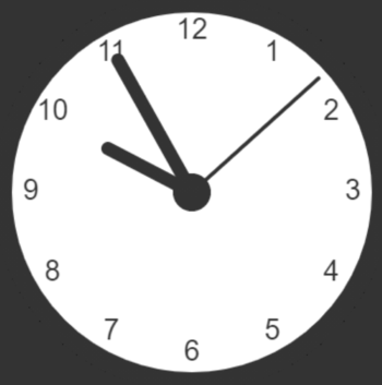
The PI clock face
This example was found on W3 and I was surprised at the complexity of it. All the heavy lifting is done in the javascript including the styling which in my opinion makes it quite hard to read and follow. I called it the PI clock face because of the repeated use of PI in its calculations which I'm not sure is necessary and is likely to confuse most newcomers which is who I think W3 targets ?
    <!DOCTYPE html>
    <html>
        <head>
            <script async src="script.js"></script>
        </head>
        <body>
            <canvas id="canvas" width="400" height="400"
                style="background-color:#333">
            </canvas>
    </body>
    </html>
    var canvas = document.getElementById("canvas");
    var ctx = canvas.getContext("2d"); //https://developer.mozilla.org/en-US/docs/Web/API/CanvasRenderingContext2D
    var radius = canvas.height / 2;
    ctx.translate(radius, radius);//The drawing point is top left corner, so bring it down and to the right by the radius
    radius = radius * 0.90//Making the circle a bit smaller than its container
    setInterval(drawClock, 1000);

    function drawClock() {
    drawFace(ctx, radius);
    drawNumbers(ctx, radius);
    drawTime(ctx, radius);
    }

    function drawFace(ctx, radius) {
    var grad;
    ctx.beginPath();//https://developer.mozilla.org/en-US/docs/Web/API/CanvasRenderingContext2D/beginPath
    ctx.arc(0, 0, radius, 0, 2*Math.PI);
    ctx.fillStyle = 'white';
    ctx.fill();
    grad = ctx.createRadialGradient(0,0,radius*0.95, 0,0,radius*1.05);//https://developer.mozilla.org/en-US/docs/Web/API/CanvasRenderingContext2D/createRadialGradient
    // grad.addColorStop(0, 'blue');
    grad.addColorStop(0.5, '#333');
    // grad.addColorStop(1, 'violet');
    ctx.strokeStyle = grad;
    ctx.lineWidth = radius*0.1;
    ctx.stroke();
    ctx.beginPath();
    ctx.arc(0, 0, radius*0.1, 0, 2*Math.PI);
    ctx.fillStyle = '#333';
    ctx.fill();
    }

    function drawNumbers(ctx, radius) {
    var ang;
    var num;
    ctx.font = radius*0.15 + "px arial";
    ctx.textBaseline="middle";
    ctx.textAlign="center";
    //Why is this using PI rather than just 30 degree steps ?
    for(num = 1; num < 13; num++){
        ang = num * Math.PI / 6;
        ctx.rotate(ang);
        ctx.translate(0, -radius*0.85);
        ctx.rotate(-ang);
        ctx.fillText(num.toString(), 0, 0);
        ctx.rotate(ang);
        ctx.translate(0, radius*0.85);
        ctx.rotate(-ang);
    }
    }

    function drawTime(ctx, radius){
        var now = new Date();
        var hour = now.getHours();
        var minute = now.getMinutes();
        var second = now.getSeconds();
        //hour
        hour=hour%12;
        hour=(hour*Math.PI/6)+
        (minute*Math.PI/(6*60))+
        (second*Math.PI/(360*60));
        drawHand(ctx, hour, radius*0.5, radius*0.07);
        //minute
        minute=(minute*Math.PI/30)+(second*Math.PI/(30*60));
        drawHand(ctx, minute, radius*0.8, radius*0.07);
        // second
        second=(second*Math.PI/30);
        drawHand(ctx, second, radius*0.9, radius*0.02);
    }

    function drawHand(ctx, pos, length, width) {
        ctx.beginPath();
        ctx.lineWidth = width;
        ctx.lineCap = "round";
        ctx.moveTo(0,0);
        ctx.rotate(pos);
        ctx.lineTo(0, -length);
        ctx.stroke();
        ctx.rotate(-pos);
    }
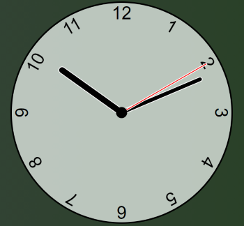
CSS is King clock
This example came from Youtube and was explained very well throughout. In this project the CSS does the heavy lifting while the javascript just helps it along. I like this style of writing, the script while needed obviously isn't the main component in this project. Sites should work without javascript and while that can't really work for a clock this is as close as you get. I wouldn't have been able to do this, I've taken away some notes for CSS variables which I was aware existed but I had never worked with, I think I'll do a quick post using them for something.
    <!DOCTYPE html>
    <html lang="en">
    <head>
        <meta charset="UTF-8">
        <meta name="viewport" content="width=device-width, initial-scale=1.0">
        <meta http-equiv="X-UA-Compatible" content="ie=edge">
        <link href="style.css" rel="stylesheet">
        <script defer src="script.js"></script>
        <title>Clock</title>
    </head>
    <body>
    <div class="clock">
        <div class="hand hour" data-hour-hand></div>
        <div class="hand minute" data-minute-hand></div>
        <div class="hand second" data-second-hand></div>
        <div class="number number1">1</div>
        <div class="number number2">2</div>
        <div class="number number3">3</div>
        <div class="number number4">4</div>
        <div class="number number5">5</div>
        <div class="number number6">6</div>
        <div class="number number7">7</div>
        <div class="number number8">8</div>
        <div class="number number9">9</div>
        <div class="number number10">10</div>
        <div class="number number11">11</div>
        <div class="number number12">12</div>
    </div>
    </body>
    </html>
    *, *::after, *::before {
        box-sizing: border-box;
        font-family: Gotham Rounded, sans-serif;
    }

    body {
        background: linear-gradient(to right, hsl(176deg 6% 26%), hsl(108deg 49% 16%));
        display: flex;
        justify-content: center;
        align-items: center;
        min-height: 100vh;
        overflow: hidden;
    }

    .clock {
        width: 300px;
        height: 300px;
        background-color: rgba(222, 231, 225, .8);
        border-radius: 50%;
        border: 2px solid black;
        position: relative;
    }

    .clock .number {
        --rotation: 0;
        position: absolute;
        width: 100%;
        height: 100%;
        text-align: center;
        transform: rotate(var(--rotation));
        font-size: 1.5rem;
    }

    .clock .number1 { --rotation: 30deg; }
    .clock .number2 { --rotation: 60deg; }
    .clock .number3 { --rotation: 90deg; }
    .clock .number4 { --rotation: 120deg; }
    .clock .number5 { --rotation: 150deg; }
    .clock .number6 { --rotation: 180deg; }
    .clock .number7 { --rotation: 210deg; }
    .clock .number8 { --rotation: 240deg; }
    .clock .number9 { --rotation: 270deg; }
    .clock .number10 { --rotation: 300deg; }
    .clock .number11 { --rotation: 330deg; }

    .clock .hand {
        --rotation: 0;
        position: absolute;
        bottom: 50%;
        left: 50%;
        border: 1px solid white;
        border-top-left-radius: 10px;
        border-top-right-radius: 10px;
        transform-origin: bottom;
        z-index: 10;
        transform: translateX(-50%) rotate(calc(var(--rotation) * 1deg));
    }

    .clock::after {
        content: '';
        position: absolute;
        background-color: black;
        z-index: 11;
        width: 15px;
        height: 15px;
        top: 50%;
        left: 50%;
        transform: translate(-50%, -50%);
        border-radius: 50%;
    }

    .clock .hand.second {
        width: 3px;
        height: 45%;
        background-color: red;
    }

    .clock .hand.minute {
        width: 7px;
        height: 40%;
        background-color: black;
    }

    .clock .hand.hour {
        width: 10px;
        height: 35%;
        background-color: black;
    }
    setInterval(setClock, 1000)

    const hourHand = document.querySelector('[data-hour-hand]')
    const minuteHand = document.querySelector('[data-minute-hand]')
    const secondHand = document.querySelector('[data-second-hand]')

    function setClock() {
        const currentDate = new Date()
        const secondsRatio = currentDate.getSeconds() / 60
        const minutesRatio = (secondsRatio + currentDate.getMinutes()) / 60
        const hoursRatio = (minutesRatio + currentDate.getHours()) / 12
        setRotation(secondHand, secondsRatio)
        setRotation(minuteHand, minutesRatio)
        setRotation(hourHand, hoursRatio)
    }

    function setRotation(element, rotationRatio) {
        element.style.setProperty('--rotation', rotationRatio * 360)
    }

    setClock()